Categories: Photoshop and Effects, Tips
05/04/06
A Portfolio for a Store

There was a gap in my postings. I am sorry for that. The reason was that I had to quickly create a portfolio for a store. The assignment included photographs of the store and a design of several pages (PDF format).
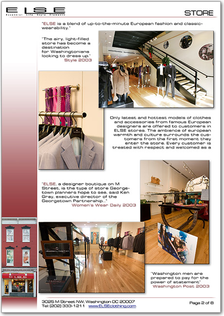
So far I just made a draft of the portfolio, but the client (Pierre Lupesco, the owner of ELSE Gallery) is already happy to see the current progress. The image above shows the second page of the portfolio.
The previous portfolio of the store was too busy; and it was hard to digest what it presented. So in my version I tried to retain simplicity with the business style. The left margin hopefuly creates the base for the page and has the facade of the store. More like a constant reminder of what it is about. The rest of the page is quite standard, except the shadows to the text and the images. I like that floating effect. The shadows somewhat separate the content from the page layout and create a lighter feel (in my opinion).
When I was taking the photographs, my goal was to interestingly present the prodcuts (clothing and accesories) and give the overal sense of the store. Two major conditions I kept in mind: (1) keep the walls straight up and (2) find better angles to draw the eye into the photograph and make it not that boring.
04/29/06
Show of Photoshop How-To Tricks by Russell Brown

Have you seen "The Russell Brown Show"? No, it's not on TV. It's on the Internet. Russel performs various tricks with Photoshop, but he doesn't hold any secrets from you. He gives them away in Tips & Techniques section of his website. And it's an instant bookmark in my browser, which is Firefox by the way ![]() .
.
04/27/06
Masking with Calculations

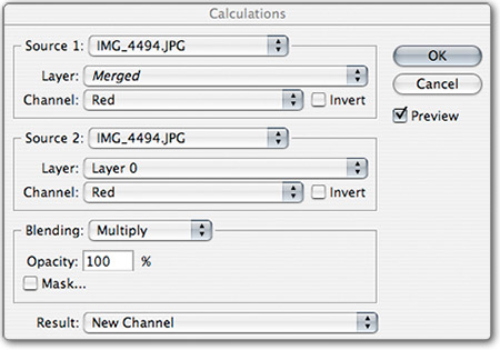
Sometimes we encounter situations when simple masking/selection doesn't work or is too time consuming to do it right. That's why professionals like to have a whole arsenal of tools to make that perfect selection. Here is another trick to tuck under the belt - Masking with Calculations (PDF).
04/25/06
Pixel2Life - Tutorials Almost About Everything
![]()
It very well be that you already know about this website, but silly me, I just found it.
16106 tutorials (and counting) about topics such as: 3D Studio Max, Adobe After Effects, Adobe Audition, Adobe Photoshop, ASP Coding, AutoCAD, Blender 3D, BodyPaint 3D, Bryce, C++ General, CGI Coding, Cinema 4D, ColdFusion, Corel Painter, CorelDraw and Corel PhotoPaint, CSS Stylesheets, Delphi, DreamWeaver, Fireworks, FreeHand, FruityLoops, General Website Development, Gimp, GoLive, HTML Tips and Tricks, Illustrator, Image Ready, InDesign, Java Development, JavaScript, Lightwave 3D, Macromedia Director, Macromedia Flash, Maya 3D, Microsoft Access, Microsoft Excel, Microsoft FrontPage, Microsoft Outlook, Microsoft PowerPoint, Microsoft Publisher, Microsoft Word, PageMaker, Paint Shop Pro, Perl, PHP Coding, Poser, Premiere and Premiere Pro, Rhino 3D, Sound Forge, Swift 3D, SWiSH, Terragen, Visual Basic and Visual C++.
04/21/06
Free Shape Crop using Clip Mask

You probably noticed that images in the blog posts have rounded borders and shadows. I know that some people don't know how to do it, so here I am going to cast some light on this subject. To create such a crop of the image you can use any shape or just simply paint with brush. And the shadow here is just an optional effect, which you can replace with your own.
Photography Things
When we find something interesting and useful, which we want to return to and share with others, it will be posted here. It could be about composition, digital effects, photoshop, photography business or links to interesting websites.
Subscribe to RSS feed
| Sun | Mon | Tue | Wed | Thu | Fri | Sat |
|---|---|---|---|---|---|---|
| << < | ||||||
| 1 | 2 | 3 | 4 | 5 | 6 | |
| 7 | 8 | 9 | 10 | 11 | 12 | 13 |
| 14 | 15 | 16 | 17 | 18 | 19 | 20 |
| 21 | 22 | 23 | 24 | 25 | 26 | 27 |
| 28 | 29 | 30 | ||||
Archives
- August 2008 (1)
- July 2008 (12)
- November 2007 (8)
- October 2007 (3)
- September 2007 (7)
- August 2007 (16)
- July 2007 (13)
- June 2007 (27)
- May 2007 (27)
- April 2007 (14)
- March 2007 (16)
- February 2007 (6)
- More...
Misc
 XML Feeds
What is RSS?
Who's Online?
- Guest Users: 54

Categories
- All
- Announcements (9)
- Business of photography (45)
- Equipment (72)
- General Photography (135)
- Lightroom Tips & Tutorials (10)
- News (11)
- Photographs (67)
- Photoshop and Effects (83)*
- Tips (17)*
- Story of a Photograph (3)
- Studio Photography (25)
- Web & Presentation (35)
- Wedding Photography (44)
- Wedding Planning (3)
LATEST POSTS
- 3D Is Not Enough - Meet 6D
- Understanding Light Stops
- Serious about becoming a Pro Wedding Photographer?
- Top 10: Ridiculous Wedding Customs
- Old Image Technique
- Pro Photo Life Blog
- Filters 101
- 10 Ways to Take Stunning Portraits
- When Pictures Hurt Websites
- Tips for Better Digital Photo Composition 101


