04/27/06
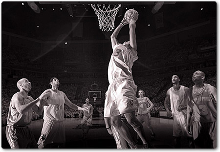
Infrared Basketball Photography

Photo by Tom Dahlin
Illuminated by two sources: Dahlin's ceiling mounted Dynalights and the floor level IR flash. Here the ceiling strobes were used to add a little fill light to the background, and were dialed down to be about 1 stop below the floor strobe.
What an interesting approach to sport photography. Read the article on SportsShooter.com about an assignment where the client was "... looking for unique images beyond the standard through the glass, overhead, and post remotes stuff we all shoot so much of ...".
04/26/06
Article-Level Page Design: What Matters Inside?

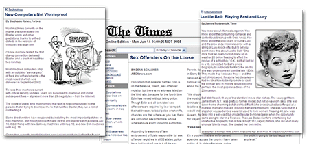
One of my tasks is to write and maintain the articles on this website. That's why I am always looking for an interesting read about usability and overall design. Recently I posted about "Writing For Web" and here I continue this interesting topic. Today I came across an article about "Article-Level Page Design". It tells us what things can help to keep the reader interested in the content we present. Don't forget to browse that website for other articles, such as Using Headline & Blurbs on News Homepages, Headline Size on News Homepages and Online Images: Faces, Size Attract.
04/25/06
Pixel2Life - Tutorials Almost About Everything
![]()
It very well be that you already know about this website, but silly me, I just found it.
16106 tutorials (and counting) about topics such as: 3D Studio Max, Adobe After Effects, Adobe Audition, Adobe Photoshop, ASP Coding, AutoCAD, Blender 3D, BodyPaint 3D, Bryce, C++ General, CGI Coding, Cinema 4D, ColdFusion, Corel Painter, CorelDraw and Corel PhotoPaint, CSS Stylesheets, Delphi, DreamWeaver, Fireworks, FreeHand, FruityLoops, General Website Development, Gimp, GoLive, HTML Tips and Tricks, Illustrator, Image Ready, InDesign, Java Development, JavaScript, Lightwave 3D, Macromedia Director, Macromedia Flash, Maya 3D, Microsoft Access, Microsoft Excel, Microsoft FrontPage, Microsoft Outlook, Microsoft PowerPoint, Microsoft Publisher, Microsoft Word, PageMaker, Paint Shop Pro, Perl, PHP Coding, Poser, Premiere and Premiere Pro, Rhino 3D, Sound Forge, Swift 3D, SWiSH, Terragen, Visual Basic and Visual C++.
04/21/06
Free Shape Crop using Clip Mask

You probably noticed that images in the blog posts have rounded borders and shadows. I know that some people don't know how to do it, so here I am going to cast some light on this subject. To create such a crop of the image you can use any shape or just simply paint with brush. And the shadow here is just an optional effect, which you can replace with your own.
04/20/06
Photoshop Roadmap Resource

This is a website with an extensive lists of Photoshop tutorials, actions, brushes, plug-ins, books and other stuff. It's just another link for your bookmarks.
Photography Things
When we find something interesting and useful, which we want to return to and share with others, it will be posted here. It could be about composition, digital effects, photoshop, photography business or links to interesting websites.
Subscribe to RSS feed
| Sun | Mon | Tue | Wed | Thu | Fri | Sat |
|---|---|---|---|---|---|---|
| << < | ||||||
| 1 | 2 | 3 | 4 | |||
| 5 | 6 | 7 | 8 | 9 | 10 | 11 |
| 12 | 13 | 14 | 15 | 16 | 17 | 18 |
| 19 | 20 | 21 | 22 | 23 | 24 | 25 |
| 26 | 27 | 28 | 29 | 30 | 31 | |
Archives
- August 2008 (1)
- July 2008 (12)
- November 2007 (8)
- October 2007 (3)
- September 2007 (7)
- August 2007 (16)
- July 2007 (13)
- June 2007 (27)
- May 2007 (27)
- April 2007 (14)
- March 2007 (16)
- February 2007 (6)
- More...
Misc
 XML Feeds
What is RSS?
Who's Online?
- Guest Users: 55

Categories
- All
- Announcements (9)
- Business of photography (45)
- Equipment (72)
- General Photography (135)
- Lightroom Tips & Tutorials (10)
- News (11)
- Photographs (67)
- Photoshop and Effects (83)
- Tips (17)
- Story of a Photograph (3)
- Studio Photography (25)
- Web & Presentation (35)
- Wedding Photography (44)
- Wedding Planning (3)
LATEST POSTS
- 3D Is Not Enough - Meet 6D
- Understanding Light Stops
- Serious about becoming a Pro Wedding Photographer?
- Top 10: Ridiculous Wedding Customs
- Old Image Technique
- Pro Photo Life Blog
- Filters 101
- 10 Ways to Take Stunning Portraits
- When Pictures Hurt Websites
- Tips for Better Digital Photo Composition 101


